
Welcoming you back to our vibrant, digital realms where we explore the brilliance of web design, today we take a deep dive into the visual language of color.
How paramount is its role in web design, you might ask?
Well, the answer is – very! Playing a pivotal part in not only the aesthetics but, more subtly, the psychological effect on website users, color is an indispensable facet of effective web designing.
In our latest blog post we’ll take you on a journey from understanding the nuances of color psychology to actionable tips for leveraging color effectively in web design.
We aim to trigger inspiration and equip you with knowledge, making you a true artist in web designing. So buckle up and gear yourselves for this splash of color coming your way!
Understanding the Psychology of Color Theory in Web Design
Before we dive into the nuts and bolts of color usage in web design, let’s take a moment to grasp a key concept – the psychology of color theory and design.
“Color psychology,” you ponder?
Yup. It’s precisely what it sounds like – the study of how we can use the colors to influence human behavior and decisions. So, what does this have to do with web design? Well, a whole lot!
In the digital arena, where first impression counts, colors can be an excellent tool to evoke emotions, trigger certain associations, and induce desired actions from users.
For example, would your website seem as friendly if you used aggressive red instead of calming blue? Highly unlikely, right? The use of color can literally ‘color’ a visitor’s perception of your brand.
The key takeaway here?
Understanding color psychology is crucial in web design because colors aren’t just meant to beautify; they carry meaning and wield power. Trust us, it’s a fascinating realm, so hold your horses as we unfold this technicolor tale.
Importance of Color in Web Design
Color is not just an aesthetic choice in web design. It’s a powerful and compelling tool that has a profound impact on your website’s overall appeal and usability.
Like a silent, yet persuasive communicator, it influences our emotions and decisions, engaging your audience on a subconscious level.
Ever wonder why ‘Add to Cart’ buttons are often bright and bold? That’s because colors are responsible for increasing web conversion rates.
A well-thought-out color palette can shape user experience, facilitating site navigation by highlighting key areas or CTAs. Sounds simple, right?
But be warned – color missteps can also lead to confusion and user frustration. And remember, color can create a memorable brand identity.
One glance at Facebook’s unmistakable blue or Netflix’s bold red, you know exactly where you are on the web.
Thus, understanding the importance of color in web design is fundamental to a powerful and effective web presence. Stay tuned to delve more into color theories and tips to harness their full potential!
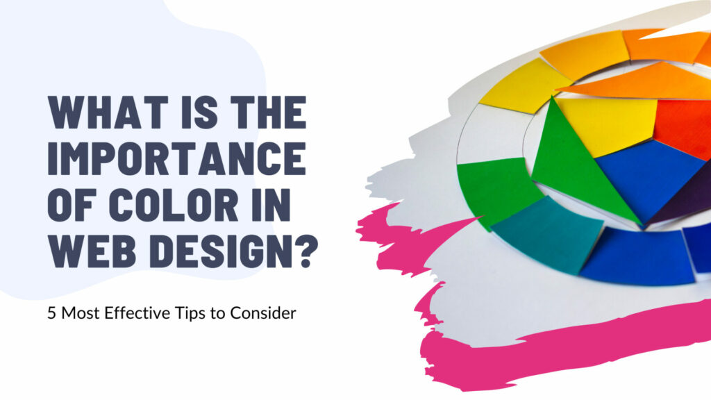
5 Essential Tips on Using Color in Web Design
The perfect blend of hues and tones can enhance user experience, reinforce brand identity, and lead to higher conversion rates.
Getting color choices right is by no means an easy feat. But don’t worry, we’ve got your back. In the following section, we will provide you with 5 essential tips on using color in web design.
You’ll learn how to use color to convey meaning, maintain consistency, and prioritize contrast. We’ll also touch on the often-ignored aspect of cultural color perception and the importance of color accessibility.
All of these tips are tried and tested ingredients in the recipe for a website that not only looks great but performs efficiently. So, let’s embark on this colorful journey together, shall we?
Tip 1: Use Color to Convey Meaning
Let’s dive into our very first tip – using color to convey meaning. Now, this might sound a bit nebulous at first. What does it mean exactly, to use color to…well, communicate? But stick with me here folks, because this is where it gets exciting.
So you see, that different colors essentially act as its own language in web design. Every hue has the power to elicit specific emotions and reactions from your users.
Vibrant reds can express urgency or passion, cool blues evoke trust and calm, while neutral greys provide a professional, sleek look. It’s pretty much like magic but with color palletes!
So, the next time you’re tasked for website color selection, then hold for a beat. Think about what kind of mood you intend to spell out. What sort of message you want to convey? Maybe you want to inspire trust, or evoke elegance.
Take the plunge and choose colors that help you weave that narrative. Who knew colors held such storytelling power, right?
Color theory, is a game changer in creating impactful web designs. Remember this when you’re next composing your digital masterpiece.
Tip 2: Maintain Color Consistency
Now, let’s step into our second key color concept: maintaining color consistency. Think of this tip as the rhythmic beat in the symphony of web design.
It serves as an unwavering pillar, a steadfast staple that helps orchestrate your site’s visual harmony. You see, consistent color usage is pivotal for cultivating a cohesive, professional, and trustworthy website appearance.
What’s more? It also influences how users perceive, interact, and remember your brand. Ever came across a website where each page felt like a different universe altogether? Disorienting, isn’t it?
There you go, that’s the aftermath of inconsistent color schemes. Sticking to a consistent color palette ensures that your pages flow seamlessly into each other, giving users a smooth and enjoyable browsing experience.
So, remember: whether it’s your headings, backgrounds, hyperlinks, call-to-action buttons, or text color, consistency is the key to the castle of impressive web design.
Tip 3: Prioritize Contrast and Balance
This tip is all about striking the right balance. Now, when we talk about color in web design, contrast and balance aren’t just stylish words thrown into the mix.
They hold significant weight, placing an important role in making your website visually appealing and user-friendly.
The magic trick? It’s all about pairing colors that complement each other while creating enough distinction to make your content stand out. Like making a brand identity using the right blend of primary colors and secondary colors.
But it’s not just about picking two colors that look good together – no, it goes deeper than that. Try to think about the emotional weight each color carries.
Consider how these colors can balance each other out. For instance, if you are using a bold, intense color like red, balance it out with something softer.
Think about the main color of your website. Does it speak your brand? How about the tertiary color or the analogous color? These are not just mere pigments you put in; these are powerful tools in maintaining your site’s consistency, balance, and harmony.
Try combining two or three colors. Then take your website a notch higher by understanding and leveraging the basics of color theory, such as complementary colors, cool colors, and warm colors.
And let’s not forget about contrast. High contrast can help text and other important elements stand out, but too much contrast can strain the eyes. Color contrast is a crucial aspect of accessibility. Users with visual impairments should be in mind when designing your website.
See? It’s all about finding that perfect equilibrium.
Tip 4: Consider Audience and Cultural Differences in Color Perception
Not all colors are perceived equally across the globe. Believe it or not, this little nugget of wisdom can significantly impact your web design success.
You see, different cultures associate different meanings with colors. For example, white may symbolize purity and innocence in Western cultures, but in some Eastern cultures, it represents mourning and bad luck.
Can you imagine the impact on your brand if you pick the “wrong” color?
Always keep your target audience in mind. Their cultural background, their national sensibilities, even age-related perceptions, all come into play.
Research well, understand where they’re coming from, strike the balance necessary. It’s your audience you’re trying to reach, resonate with, impress, and possibly convert.
This might seem complicated, but it’s not really – all it requires is a bit of empathetic insight and lateral thinking.
So, never neglect the importance of considering color perception when designing your website.
Tip 5: Understand and Implement Color Accessibility
Let’s pause for a moment and dig into an often overlooked, yet utterly significant aspect of color in web design – color accessibility.
Have you ever pondered the impact of your color choices on those with color vision deficiency? Let’s shed some light on this critical topic!
In the global context, approximately 8% of men and 0.5% of women experience some form of color blindness. That’s a significant segment of your potential audience whose user experience could be compromised if color accessibility isn’t appropriately considered.
Don’t let those stunning hues be a roadblock for anyone! Isn’t that fascinating?
In web design, color accessibility generally refers to ensuring that the color palette you use is easily discernible and navigable by individuals with a variety of visual abilities. It’s all about inclusivity, friends!
Here’s a hot tip – online tools such as Contrast Checker and Color Safe can be really helpful in maintaining a web design that is welcoming for all.
At the end of the day, it’s about making every user’s journey on your website an enjoyable, smooth, and memorable one, regardless of who they are. Stay enlightened, fellow web designers!
Noted Pitfalls in Color Usage in Web Design
Surely, colors can give your website an aesthetic appeal, drive user engagement and enhance usability. However, improper use of colors can also result in several notable pitfalls and limit your website’s potential.
So, let’s take a moment and delve into some of these pitfalls.
- For instance, overuse of vibrant hues could overwhelm the visitor’s eye and make your content unreadable, thus driving visitors away from your site.
- Excessively muted or pastel tones may cause a lack of contrast, leading to a dull and uninspired look, defeating the purpose of a dynamic web presence.
- Another notable pitfall is the lack of color consistency across different screens. Not all devices display colors similarly, which can negatively impact the overall user experience.
- Lastly, disregarding color psychology could lead you to select colors that do not align with your brand’s personality or message, resulting in a disconnect for your users.
In the world of web design, mastering color usage is an intricate balancing act. Avoiding these pitfalls and being aware of their potential implications could be the difference between a successful and a less effective website design.
Stay tuned, because next, we will be providing valuable tools and resources to harness color power effectively.
Using Color Effectively: Tools and Resources
Navigating the world of color in web design can seem like a daunting task, don’t you think? But don’t fret! There’s a plethora of tools and resources out there. So, let’s explore some of these effective routes to play your cards right with colors!
Adobe Color CC is a game-changer. It’s essentially a color wheel that simplifies color theory. Feeling color-clueless?
Canva’s Color Palette Generator can rescue you. It creates a palette from an uploaded image.
Voila! You get complimentary colors that pretty much do the magic. In this vein, Coolors.co and Paletton are also fantastic for creating harmonious color schemes.
Now, here comes the jewel – Color Safe. Ever thought about color blind users? This tool helps create accessible web color schemes based on WCAG compliance guidelines. Amazing, isn’t it?
Lastly, don’t hesitate to use tools like color picker to help you with exact hues. Mixing neutral colors is also a good practice as it brings a certain calmness and professionalism to your website.
So, the mantra is simple – Design not just for looks, but for usability too! Whether you’re a newbie or a seasoned pro, these resources can take your web color fluency to a new level.
Lets Upgrade Your Website Looks
At Komomedia, we’re always thrilled to help you illuminate your brand’s voice with our range of services, especially in Web Design.
Think about your website right now. Are the colors engaging yet soothing? Does every element sync harmoniously to provide a seamless user experience? Perhaps it’s time for a change or a refreshing uplift. But don’t worry about the how, that’s where we come in.
Applying these newly learned insights about the importance of color in web design, our team of expert web designers at Komomedia will leverage their experience and skills to upgrade your website’s looks into a visually immersive and customer-centric online storefront.
We invite you to get in touch with us and see how we can create a splash of color that drives your online success.
Together, we can transform the color palette of your website, creating a visual representation of your brand that doesn’t just look impressive, but also functions seamlessly and draws in your audience.
After all, delivering rich experiences and turning possibilities into realities drive us at Komomedia.
Conclusion
In conclusion, using the right color in web design is as essential as the content and structure of your website. The impact of color usage goes beyond visual appeal: it affects user experience, increases brand recognition, and even drives conversion.
Remember, web design is not just about getting your product or service out there. It’s also about building a connection with your audience and communicating your brand and its value to them.
Taking a step back, digest what we have traversed through; the psychology of color theory, and its mighty importance. Never underestimate the magic wand – the five essential tips, that can transform your website into an emissary of the brand speaking volumes without uttering a word.
What’s vital is to explore, experiment but also consistently adapt to the evolving web design trends and audience preferences. Understand that missteps do occur but don’t let color pitfalls intimidate you, but rather be your guiding source towards a more inclusive and engaging web design approach.