
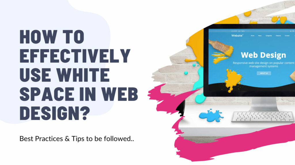
Welcome to another enlightening read! Ever seen a web page so crammed with content that it felt overwhelmingly chaotic?
Or ever stumbled upon a website with such clean, minimalistic design you thought – “What do they do again?”
If you’ve been nodding along, then you’ve encountered the paradox of white space in web design. But what’s this mysterious element? And how can you find that sweet spot where design and functionality meet?
Buckle up, web design enthusiasts! In this blog post, we’ll delve into the nitty-gritty of effectively using white space in website design.
When executed effectively, it greatly enhances readability, guides the viewer’s attention, and elevates your overall design.
We’ll explore its significance and come up with actionable tips that will let your designs breathe while retaining user engagement. Ready to enhance your web designing prowess?
So, let’s jump right in and explore how to effectively use c, improving your user experience and boosting your website’s appeal. Buckle up for an informative ride!
How do we define White Space in web design?
White Space, just as it sounds – is simply the ‘unmarked’ areas of your screen, the parts left blank or empty.
It can be any color, not necessarily white, and it includes the spacing between graphics, margins, gutters, paragraphs, lines of type, and other elements too.
You can think of it as the silence between notes in a musical composition – it might seem unimportant or even unnecessary, but in reality, it plays a pivotal role in the overall harmony and readability.
A well-proportioned and balanced use of white space is a hallmark of professional design, whether it be for websites, print, or digital media.
Sounds interesting? Stay tuned, because we’re just getting warmed up!
How it enhances your Website?
When talking about web design, often the conversation circles around vibrant colors, eye-catching graphics, or dynamic animations. However, one of the silent heroes of an outstanding web design is the humble ‘white space’.
But how does this seemingly empty space enhance your website, you ask? So, let’s dive into the magical benefits of white space!
Readability
First off, it increases readability. By providing breathing space around text and graphics, white space ensures that users can easily digest information, leading to an improved user experience.
Visual hierarchy
Secondly, it enhances visual hierarchy. By suitably using ‘white space’, you can guide visitors’ eyes to the most critical elements on your site. It’s like your understated website tour guide, showing the path like a real champ!
Elegant Look
Furthermore, it gives your design a sophisticated, clean look, synonymous with modernity and professionalism. Clutter is passé, give me the serene elegance of white space any day!
Interaction
Lastly, the strategic use of white space can massively improve interaction rates. By visually emphasizing call to action buttons or important icons, it indirectly nudges visitors to click where it matters most.
So, are you capturing the power of ‘white space’ on your website? The silent, yet potent tool in your web design repertoire?
If not, time to reconsider, as white space can indeed be the ultimate game-changer, paving the way for high-performing, SEO-friendly, visually appealing websites.
Different types of white space (micro and macro)
Broadly, there are two kinds of white space that you can effectively use in web design – micro and macro. Lets briefly discuss them:
Micro White Space
This refers to the small-scale spaces that exist between elements of a design or a layout. These could be the gaps between lines of text, the space around an image or the partition between menu items.
It can be likened to the ‘silence’ between notes in music, lending subtlety and harmony to the overall composition. It ensures your webpage doesn’t appear cluttered while also aiding in better legibility.
Macro White Space
On a larger scale, macro white space is the space surrounding major layout segments. This could be the considerable space around a key visual, or the space separating different sections of a webpage.
These grand pauses imbue your design with elegance and sophistication, contributing to a clean, minimalist look that’s extremely popular today.
By leveraging macro white space, you can guide your visitors’ eyes to specific elements, enhancing user engagement on your site.
Understand these elements, experiment with them, find the balance and you’ll begin to see how effectively you can use white space in your web design. It’s much more than an empty space – it’s a space full of opportunities!
Best Practices for using White Space
White space or ” Negative Space “, as it’s often referred to, can have a significant impact on your web design overall. Getting it right isn’t always a piece of cake; it necessitates a keen awareness of aesthetics and a deep understanding of the intimacies of web design.
Seasoned web designers regard the strategic use of white space as a best practice, a fundamental design element with the power to dramatically enhance the user experience.
But how do we master the art of using white space? Let’s discuss some of the best practices to utilize white space in website design.
1. Maintain Right Balance
Strike a balance while using white space in your designs. Too much can make your site appear empty, while too little can lead to a cluttered, hard to navigate page. Keep the content-consumption process simplistic and streamlined.
2. Enhance Visual Experience
Use white space to improve readability. It’s a tool that distinguishes text, headings, and visual elements, giving the visitor an effortless navigation experience. Increasing the white space around text elevates comprehension by almost 20%.
3. Segmentize Different Elements
You can also group related elements together for effective use of white space. This helps in structuring your content logically and aids users in understanding the information hierarchy.
4. Leverage Viewer’s Journey (CTA)
Whitespace is a powerful tool that can guide the viewer’s journey through your website. You can smartly use white space to emphasize your CTAs. A right amount of white space around CTAs can successfully draw viewers’ attention and provoke user action.
By strategically leaving areas of your site blank, you can subtly direct attention to the most important elements on the page, by following the age-old rule of thumb: the eye goes where the white is.
5. Utilize Micro and Macro
Remember, not all white spaces are created equal.
Micro white space (the space between small elements like letters or menu icons) and macro white space (the space surrounding larger groups of content like paragraphs or images) serve different purposes.
Micro white space can improve readability by preventing your text from appearing too dense, while macro white space can help to separate content for easy digestibility and greater focus. Experiment with varying your use of both types, to create a site that’s as effortless to navigate as it is on the eyes.
6. Note that, Less is More
When it comes to white space, the temptation can be to fill it up with additional elements, widgets, or copy. Resist that temptation.
An overcrowded website can leave visitors feeling overwhelmed, confused or frustrated, leading to a less than optimal user experience. Embrace the principle of ‘less is more’ and let your white space do the talking.
7. Don’t Ignore Mobile Design
Lastly, don’t forget about mobile design. With more than half of all web traffic coming from mobile devices, ensuring that your white space considerations translate effectively to smaller screens is an absolute must.
This may mean increasing white space around buttons to prevent ‘fat finger’ errors, or adjusting text spacing to maintain readability on smaller devices.
Let Us Take Care of Your Website
Despite the power and importance of white space, managing it effectively is just one piece of the web design puzzle. Creating a captivating, user-friendly website requires a variety of skills and expertise – and that’s where we come in.
At KOMOMEDIA, we seamlessly integrate white space with all other design elements. We understand the psychology of web design and how to create a standout effect in the crowded digital space. SEO is our second nature, ensuring your website doesn’t just look good, but also performs well on search engine rankings. While our high-quality content writing makes sure your messages hit the mark and resonate with your audience.
If you want your website to be a genuine asset for your business, rather than just another web address, let us handle it.
CONTACT US! And lets build a compelling website for you that resonate with your brand’s tone.
Conclusion
Leveraging white space in web design is both an art and a science that can significantly amplify your user engagement and experience if done correctly. It is an integral part of modern web design practices, a secret sword for attractive, user-friendly, and effective web designs.
It’s not about filling every corner of your canvas, but appreciating the beauty and potential in the blank spaces. Don’t shy away from the emptiness; it’s time to embrace white space, and elevate your web design game to the next level. Empower the power of simplicity and sophistication. Your users are going to love it!