
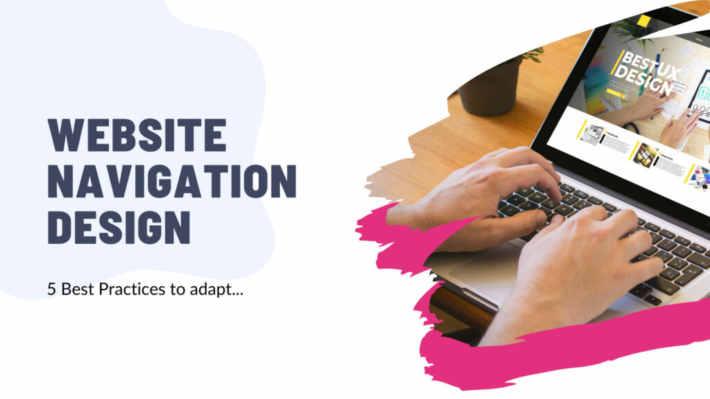
In the digital age, websites play a crucial role in connecting with your audience, showcasing your brand, and achieving your business goals. But even the most visually stunning website will fall short if users can’t find what they’re looking for. This is where website navigation design comes into play.
Effective navigation acts as the roadmap for your website, guiding users seamlessly through their journey and ultimately boosting conversions. By implementing best practices in your navigation design, you can create a user-friendly experience that keeps visitors engaged and coming back for more.
Here are 5 best practices to consider when designing your website navigation:
1. Prioritize Clarity and Simplicity:
A clear and concise navigation menu is the cornerstone of a user-friendly website. Strive for simplicity by:
- Using clear and concise language: Avoid jargon and technical terms that might confuse users. Opt for straightforward language that everyone can understand, regardless of their technical expertise.
- Organizing logically: Group related content together under clear categories. This helps users find the information they need quickly and intuitively. Consider conducting card sorting exercises to group content based on how users perceive it.
- Minimizing menu items: While providing enough options is crucial, avoid overwhelming users with an extensive menu. Aim for a balance between offering essential information and maintaining a clean and uncluttered layout.
2. Ensure Consistency Across Pages:
Users should not have to relearn how to navigate your website every time they visit a new page. Consistency is key to building user trust and creating a positive experience.
- Maintain a consistent layout: Use the same menu structure, colors, and fonts throughout your website. This reinforces brand identity and creates a sense of familiarity for users.
- Place the navigation menu in a predictable location: Typically, this means placing it at the top or left side of the website. This allows users to find it easily regardless of the page they are on.
- Maintain consistent terminology: Use the same terms for navigation labels across all pages. This avoids confusion and helps users understand the website’s content structure.
3. Make it Discoverable and Accessible:
Your website navigation shouldn’t be a hidden treasure hunt. Users should be able to easily find and access it from any page.
- Highlight the navigation menu: Use clear visual cues, such as contrasting colors or a subtle underline, to distinguish the navigation bar from the rest of the content.
- Utilize a “hamburger menu” on mobile devices: This responsive design element helps optimize navigation for smaller screens without compromising usability.
- Include a search bar: This allows users to quickly find specific information within your website, even if they don’t know the exact location of the content.
4. Leverage the Power of Breadcrumbs and Footers:
While a primary navigation menu is essential, you can further enhance user experience by incorporating additional navigation elements:
- Breadcrumbs: These are small navigational elements that display the user’s current location within the website hierarchy. This helps users understand their position and navigate back to previous pages without confusion.
- Footers: Often overlooked, footers can be valuable real estate for including secondary navigation links. Use this space to provide links to key pages, contact information, and social media profiles.
5. A/B Test and Continuously Optimize:
In the ever-evolving world of web design, what works today might not be optimal tomorrow.
- Conduct A/B testing: This allows you to compare different versions of your navigation menu and see which one performs better with real users. This data-driven approach helps you identify the most effective design for your audience.
- Track user engagement: Analyze website analytics to see which navigation elements are used most frequently and which ones are ignored. This data can inform future navigation design decisions.
- Gather user feedback: Conduct surveys or user testing sessions to gather qualitative feedback on your website navigation. This allows you to understand user pain points and identify areas for improvement.
Conclusion
By effectively implementing these best practices, you can create website navigation that is not only functional but also intuitive, user-friendly, and visually appealing. Remember, a well-designed navigation menu is an investment in your website’s success, promoting user engagement, improving conversions, and ultimately, achieving your business goals.