Are you ready to give your WordPress site a sleek, modern twist with dark mode, all without the hassle of installing a plugin?
You’re in the right place! Dark mode isn’t just a passing trend—it’s a game-changer for enhancing user experience by reducing eye strain and adding a touch of sophistication.
In this post, we’ll walk you through an easy, step-by-step process to implement dark mode on your site.
So, roll up your sleeves, grab a cup of coffee, and let’s dive into transforming your website into a dark mode masterpiece!

If you need help creating your website, don’t hesitate to contact us. Click here.
Understanding Dark Mode in WordPress
Dark mode is more than just a trendy feature; it’s a smart choice for enhancing your website’s user experience. But what exactly is dark mode?
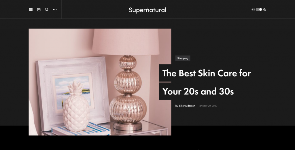
In simple terms, dark mode is a display setting that uses a dark color scheme—usually black or gray—as the background, with lighter text and UI elements.
This setup not only makes your site look sleek and modern but also helps reduce eye strain, especially in low-light conditions.
According to a study by Google, dark mode can even help extend battery life on OLED screens, making it a win-win for both you and your visitors.
Plugins can be convenient, but they often come with their own set of challenges—like slowing down your site or posing security risks.
By opting for a plugin-free approach, you maintain full control over the customization and performance of your site.
Step-by-Step Guide to Implementing Dark Mode
Are you ready to give your WordPress site a sleek, modern look with dark mode? Follow these steps to seamlessly integrate this feature without relying on plugins.
Preparing Your WordPress Theme
Before diving into the code, it’s essential to prepare your theme properly. This ensures that your changes are safe and sustainable.

Start by identifying the theme files you’ll need to modify. These typically include the style.css and possibly some JavaScript files. Backup these files before making any changes.
This way, you can easily revert if something goes wrong. You can do this by downloading the files via FTP or through your WordPress dashboard by going to Appearance > Theme Editor.
Use a Child Theme
To prevent future WordPress updates from overwriting your customizations, it’s wise to create a child theme. A child theme allows you to make changes independently of the parent theme. Here’s a quick guide:
- Create a New Folder: In your WordPress theme directory (
wp-content/themes), create a new folder for your child theme. - Create a Style.css File: Inside this new folder, create a
style.cssfile and add the following header:/* Theme Name: Your Child Theme Name Template: parent-theme-folder-name */ - Create a functions.php File: Create a
functions.phpfile in the child theme folder to enqueue the parent theme styles:
<?php add_action( ‘wp_enqueue_scripts’, ‘enqueue_parent_theme_styles’ );
function enqueue_parent_theme_styles()
{ wp_enqueue_style( 'parent-style', get_template_directory_uri() . '/style.css' ); }
Using a child theme ensures that your dark mode customizations remain intact, even after updating your main theme. This step is crucial for maintaining a robust and dependable website.
Adding Custom CSS for Dark Mode
By adjusting the visual elements through custom CSS, you can create a sleek and user-friendly dark mode experience.
The primary goal of dark mode is to switch your website’s color scheme to darker tones, which involves altering background colors, text colors, and any other elements that need to adjust to ensure readability and visual appeal.
This generally means using darker backgrounds with lighter text. It’s essential to maintain sufficient contrast for readability while ensuring that interactive elements like buttons and links are easy to spot.
Example Snippets to Change Background and Text Colors
Below are some basic CSS snippets that you can include in your child theme’s style.css file to start implementing dark mode:
- Change Background and Text Colors:
body { background-color: #121212; /* Dark background */ color: #ffffff; /* Light text color */ } - Adjust Links and Buttons:
a { color: #bb86fc; /* Lighter link color */ } button, input[type="button"], input[type="submit"] { background-color: #333333; /* Dark button background */ color: #ffffff; /* Light button text */ } - Modify Header and Footer:
header, footer { background-color: #1c1c1c; /* Darker header and footer */ color: #e0e0e0; /* Slightly lighter text */ }
These snippets serve as a foundation for transforming your website into a dark mode experience. You can further customize these styles to match your site’s branding or specific design needs.
Remember, testing is key—make sure to preview changes on different devices and adjust as necessary to ensure a consistent look across all platforms.
Using JavaScript to Toggle Dark Mode
With a bit of JavaScript, you can create a toggle button that allows visitors to choose their preferred mode, providing a personalized browsing experience.

JavaScript can be used to dynamically switch CSS classes on your website, enabling users to toggle between light and dark modes effortlessly.
By adding a toggle button, you give users the flexibility to choose their viewing preferences, which can enhance their engagement and satisfaction with your site.
Sample JavaScript Code to Create a Toggle Button
Here’s a simple example to help you implement a dark mode toggle using JavaScript:
- Add the Toggle Button to Your HTML: Insert a button within your site’s HTML where you’d like the toggle to appear. This could be in the header or a fixed position on the page:
<button id="dark-mode-toggle">Toggle Dark Mode</button> - JavaScript for Toggling Dark Mode: Use the following JavaScript code to switch between dark and light modes:
const toggleButton = document.getElementById('dark-mode-toggle'); const body = document.body; toggleButton.addEventListener('click', () => { body.classList.toggle('dark-mode'); }); - CSS for Dark Mode Class: Ensure your CSS has a
.dark-modeclass that changes the necessary styles when applied:.dark-mode { background-color: #121212; /* Dark background */ color: #ffffff; /* Light text color */ } .dark-mode a { color: #bb86fc; /* Adjusted link color for dark mode */ }
This simple setup allows users to click the button and toggle dark mode on and off. The classList.toggle method in JavaScript adds or removes the dark-mode class from the <body> element, switching between your predefined light and dark styles.
Practical Tips for Enhancing Dark Mode
Implementing dark mode is just the beginning. To truly enhance the user experience, you must focus on readability, accessibility, and cross-platform consistency.
Here are some practical tips to ensure your dark mode feature is top-notch.
Ensuring Readability and Accessibility

When designing dark mode, maintaining readability is crucial. Here are some tips to help you choose the right colors and ensure that your site remains accessible:
- Tips for Choosing Color Contrasts: Select color combinations that offer high contrast between text and background. This not only improves readability but also makes your content more visually appealing. Tools like the WebAIM Contrast Checker can help you evaluate the contrast ratios of your color choices, ensuring they meet recommended standards.
- Considerations for Accessibility Standards: Aim to comply with the Web Content Accessibility Guidelines (WCAG). This includes ensuring that text is legible against the background and that interactive elements like buttons and links are easily identifiable. Remember to provide sufficient contrast for all users, including those with visual impairments.
Testing Across Devices and Browsers
To deliver a seamless dark mode experience, it’s essential to test your implementation across various devices and browsers, guaranteeing a consistent look and feel.
- Importance of Testing on Various Devices and Browsers: Users access websites from a wide range of devices, from desktop monitors to smartphones. Each device may render colors slightly differently, so testing on multiple platforms ensures that your dark mode maintains its integrity everywhere. Additionally, different browsers might interpret CSS and JavaScript differently, making cross-browser testing crucial.
- Tools to Use for Testing and Ensuring Consistent Appearance: Utilize tools like BrowserStack or Sauce Labs to simulate how your site looks on different devices and browsers without needing physical access to each one. These tools can help identify inconsistencies and allow you to make adjustments accordingly. Additionally, using developer tools within browsers can help you inspect elements and debug issues as they arise.
By prioritizing readability, accessibility, and thorough testing, you can create a dark mode feature that not only looks fantastic but also enhances the overall user experience for everyone visiting your site.

If you need help creating your website, don’t hesitate to contact us. Click here.
Conclusion
Implementing dark mode in WordPress without plugins is a rewarding endeavor that enhances user experience by offering a visually appealing, customizable, and performance-friendly solution. By carefully preparing your theme, utilizing CSS and JavaScript for user-controlled toggling, and focusing on readability and accessibility, you can create a seamless dark mode experience. Remember, thorough testing across devices and browsers ensures consistency and reliability.
If you need any assistance with implementing dark mode or have any questions, feel free to reach out. You can contact me through the contact form, or connect via Instagram or Facebook. I’m here to help you every step of the way!

