Creating a stunning design is an exciting journey, and one of the most crucial steps along the way is understanding mockups. If you’re new to graphic design, you might be wondering: what exactly are mockups, and why should you care?
Think of a mockup as your design’s first impression—it’s a powerful tool that brings your ideas to life and helps you visualize the final product before it’s even built.
Whether you’re a budding designer or a business owner looking to communicate your vision, mastering mockups can elevate your projects and streamline your creative process.
Ready to dive in and discover how mockups can transform your design experience? Let’s get started!

If you need help creating your website, don’t hesitate to contact us. Click here.
What is a Mockup?
When you hear the term mockup, think of it as a visual representation of your design. Imagine you’re preparing a delicious meal; before you cook, you might look at a recipe or a picture of the dish to see how it’s supposed to look.
Similarly, mockups help you visualize what your final product will be, giving you a clearer picture of the design before any coding or building happens.

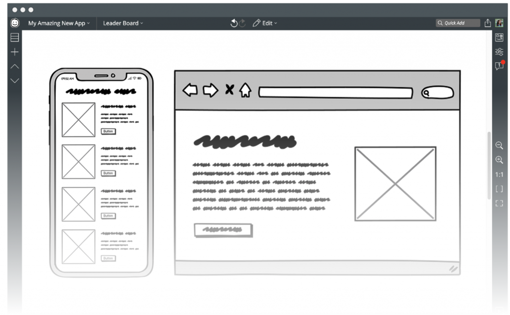
Now, it’s essential to understand that mockups are different from wireframes and prototypes. Wireframes are basic outlines of a layout, showing where elements will go but lacking detailed design.
On the other hand, prototypes are more interactive and give users a feel for how the final product will function. Mockups sit in between these two stages, providing a detailed, static representation that showcases colors, images, and typography.
Purpose of Mockups
The primary purpose of mockups is to visualize the final product. They allow you to see how all the design elements come together, making it easier to spot potential issues before they become costly mistakes.
Additionally, mockups serve as an effective tool to communicate ideas with clients and team members. When you present a mockup, you’re not just showing a concept; you’re telling a story about how the final product will look and feel.

With mockups in your toolkit, you’re well on your way to creating stunning designs that resonate with your audience. So let’s explore more about how to create and utilize them effectively!
Types of Mockups
When it comes to mockups, there are several types you can choose from, each serving a unique purpose in the design process. Understanding these types will help you select the right one for your project, ensuring that your ideas shine through.
Static Mockups
Static mockups are essentially images that represent your design without any interactive elements. Think of them as a snapshot of what the final product will look like. These types are commonly used in presentations to clients or stakeholders since they provide a clear visual without any distractions.
- Use Cases: Static mockups are perfect for early-stage designs where you want to convey layout, color schemes, and typography. They are often used in branding projects, marketing materials, and website designs.
- Easy to create
- Quick to share
- Straightforward for stakeholders
- They don’t show how users will interact with the design, which can lead to misunderstandings
Interactive Mockups
Interactive mockups, on the other hand, take things a step further by allowing users to click through and experience the design as if it were a real product. This functionality helps simulate user interactions and gives a better sense of how the final design will operate.
Tools Used to Create Interactive Mockups:
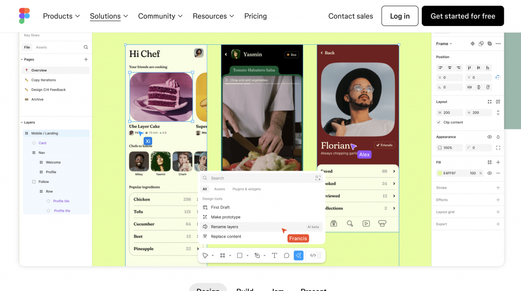
Popular tools for creating interactive mockups include Figma, InVision, and Adobe XD. These platforms enable you to build clickable prototypes that mimic user experiences.
- Enhanced User Experience
- Realistic Feedback
- Improved Communication
- Used for User Testing
- Efficiency in Design Iteration
- Time-Consuming
- Complexity
- Resource Intensive
- Limited Scope
Interactive mockups are invaluable when you want to test user flows and gather feedback on usability before moving into development. They provide a more dynamic way to showcase your designs to clients, making it easier to validate concepts.
High-Fidelity vs. Low-Fidelity Mockups
Understanding the difference between high-fidelity and low-fidelity mockups is crucial when deciding how detailed your mockup needs to be.
| High-Fidelity Mockups | Low-Fidelity Mockups |
| ✔ These are detailed representations that closely resemble the final product. They include real images, precise color palettes, and fine typography. | ✔ These are more basic and focus on layout rather than detail. Think of them as rough drafts that prioritize structure and functionality over aesthetics. |
| ✔ High-fidelity mockups often feature intricate details and are used later in the design process. They’re great for presenting polished designs to clients and stakeholders. | ✔ Low-fidelity mockups typically use simple shapes and placeholder text. They’re useful for brainstorming sessions and initial feedback because they allow you to focus on the overall flow without getting bogged down by details. |
When to Use Each Type:
Use high-fidelity mockups when you need to showcase a polished design or seek approval from clients. While opt for low-fidelity mockups during the brainstorming phase, where you want quick feedback on layout and user experience without overwhelming details.
By understanding these types of mockups, you can choose the right approach for your project, ensuring you communicate your ideas effectively and keep your design process moving smoothly!
Benefits of Using Mockups
In the world of graphic design, mockups are more than just pretty pictures—they are powerful tools that can significantly enhance your workflow and communication. Let’s explore some of the key benefits of using mockups in your design projects.
Improved Communication
One of the standout advantages of mockups is their ability to facilitate improved communication. When you present a design concept, words alone can often fall short. Mockups serve as visual aids, helping you explain your ideas more effectively.
By showing a mockup, you can illustrate how different elements fit together and how users will interact with the design. This visual representation makes it easier for everyone involved—whether clients, team members, or stakeholders—to understand your vision. Instead of getting lost in technical jargon, they can see exactly what you mean.
Enhanced Client Feedback
Mockups also make it simpler for clients to provide valuable input. When clients can visualize the design, they can give more informed feedback, leading to a more collaborative process.
Static or interactive mockups allow clients to engage with the design on a deeper level. They can see how layouts work, where buttons are placed, and how colors complement each other. This clarity reduces confusion and helps clients articulate their thoughts, leading to more constructive discussions.
Saves Time and Resources
One of the most impactful benefits of using mockups is that they can save time and resources throughout the design process.
By presenting a clear visual representation early on, you minimize the chances of misunderstandings later in the project. When everyone has a shared understanding of the design direction, it reduces the likelihood of costly revisions. This efficiency not only saves time but also helps keep your project on schedule and within budget.
In summary, incorporating mockups into your design workflow can lead to better communication, more effective client feedback, and significant time savings.
How to Create Effective Mockups
Creating effective mockups is a crucial step in the design process that can make all the difference in delivering a successful project. Here’s a guide to help you navigate through the process and create mockups that truly resonate with your audience.

Gather Requirements
The first step in creating effective mockups is to gather requirements. This means taking the time to understand your client’s needs and the specific goals of the project.
Schedule a meeting with your client to discuss their vision. Ask questions about their target audience, desired functionalities, and any branding guidelines they may have.
The more you know, the better equipped you’ll be to create a mockup that aligns with their expectations. Remember, clarity at this stage will save you time and effort later on!
Choose the Right Tools
Once you have a clear understanding of the requirements, it’s time to choose the right tools for creating your mockups. The right tool can enhance your design process and make collaboration easier. Here is an overview of popular mockup tools:
- Figma: A web-based tool that’s great for collaboration, allowing multiple users to work on a design simultaneously. It’s perfect for teams wanting real-time feedback.
- Adobe XD: Known for its intuitive interface, Adobe XD offers powerful features for creating both static and interactive mockups.
- Sketch: A favorite among Mac users, Sketch is user-friendly and offers a variety of plugins that enhance its functionality.
Each of these tools has its unique strengths, so consider your project needs and team dynamics when making your choice.
Focus on User Experience (UX)
When creating mockups, always keep in mind the importance of user experience (UX). Your design should prioritize how users will interact with the product.
Importance of User-Centered Design in Mockups:
Think about the user’s journey from start to finish. Ensure that your mockup showcases intuitive navigation, clear calls to action, and an overall pleasant experience. By putting yourself in the users’ shoes, you can create designs that not only look good but also feel good to use.
Iteration and Feedback
Lastly, remember that creating effective mockups is an iterative process. Don’t be afraid to seek out feedback and make improvements along the way.
Share your mockups with clients and team members early and often. Encourage them to provide feedback and ask questions. This collaborative approach fosters open communication and ensures that everyone is aligned on the project goals. Be prepared to make adjustments based on this feedback; iteration is key to refining your design.
By following these steps—gathering requirements, choosing the right tools, focusing on user experience, and encouraging feedback—you’ll be well on your way to creating effective mockups that not only meet but exceed expectations. Happy designing!
Best Practices for Designing Mockups
Creating effective mockups isn’t just about having the right tools and following the steps; it’s also about adhering to best practices that can enhance your designs. Here are some essential tips to keep in mind as you design your mockups.
Consistency in Design Elements
One of the foundational principles of good design is consistency. When creating mockups, ensuring that your design elements are cohesive is crucial.
A consistent visual style helps convey professionalism and builds trust with your audience. Use a unified color palette, typography, and button styles throughout your mockup. This not only makes your design aesthetically pleasing but also enhances usability. When users encounter familiar elements across your design, it creates a smoother experience and makes navigation intuitive.
Use Real Content
Another best practice is to use real content whenever possible. While it might be tempting to use placeholder text and generic images, incorporating actual content can dramatically improve your mockup’s effectiveness.
Real content allows clients and stakeholders to better understand the design’s functionality and how it will resonate with the target audience. It also provides a more accurate representation of the final product. For example, using actual product images rather than stock photos helps visualize how the branding and design will look in practice, making feedback more relevant and actionable.
Keep It Simple
Simplicity is key when designing mockups. A cluttered design can overwhelm viewers and obscure the main message.
Strive for clarity by prioritizing the most critical elements of your design. Limit the number of colors, fonts, and graphics to create a clean layout that highlights what matters most. By showcasing key features without distractions, you guide the viewer’s attention to the essential aspects of your design, making it easier for them to provide focused feedback.
In summary, following these best practices—maintaining consistency in design elements, using real content, and keeping your designs simple—will elevate your mockups and enhance communication with clients and team members. With these tips in hand, you’re ready to create mockups that not only look great but also effectively convey your design vision!

If you need help creating your website, don’t hesitate to contact us. Click here.
Conclusion
In conclusion, understanding what mockups are in graphic design is essential for both designers and clients. We’ve explored the different types of mockups, their benefits in enhancing communication and feedback, and best practices to create effective designs. By incorporating these strategies, you can elevate your design process, ensuring that your ideas are clearly communicated and well-received.
If you need assistance implementing these techniques or have any questions, feel free to reach out! You can contact us through our contact form, or connect with us on Instagram and Facebook. We’re here to help you bring your design visions to life!

