
Are you ready to transform your WordPress website into a mobile-friendly powerhouse?
With more users browsing from their phones than ever before, having a responsive design isn’t just a luxury—it’s a necessity!
In this post, we’ll share essential tips and tricks that will not only make your site look stunning on any device but also boost your search engine rankings and keep your visitors engaged.
Let’s dive in and unlock the secrets to a seamless user experience that will keep your audience coming back for more!

If you need help creating your website, don’t hesitate to contact us. Click here.
What is Responsive Web Design?
Responsive web design is all about creating websites that look great and work well on any device, whether it’s a desktop, tablet, or smartphone.
Imagine this: you visit a website on your phone, and instead of pinching and zooming to read the content, everything fits perfectly on your screen.
That’s the magic of responsive design! It uses techniques like fluid grids, flexible images, and media queries to adapt the layout and content to fit different screen sizes seamlessly.
Why is Responsive Design Important?
Well, according to a recent study, over 50% of web traffic now comes from mobile devices. If your site isn’t responsive, you risk losing potential visitors who might leave in frustration.
As designer Ethan Marcotte puts it, “Responsive design isn’t just a trend; it’s a necessity.”
By making your WordPress site responsive, you not only improve user experience but also enhance your SEO, helping your site rank higher in search results.
So, let’s dive into how to make WordPress responsive and ensure your website shines on every device!
Tips for Making Your WordPress Site Responsive
Here are some tips on how to make your site responsive:
Choose a Responsive Theme
One of the most crucial steps in making your WordPress site responsive is selecting a responsive theme. A responsive theme is designed to automatically adjust its layout and content based on the screen size of the device being used.
This means that whether your visitors are on a smartphone, tablet, or desktop, your site will look fantastic and function perfectly.
But why is this so important? Well, if your theme isn’t responsive, you could frustrate users who struggle to navigate your site on their mobile devices.
Studies show that 88% of online consumers are less likely to return to a site after a bad experience. So, giving your users a seamless experience right from the start is essential!
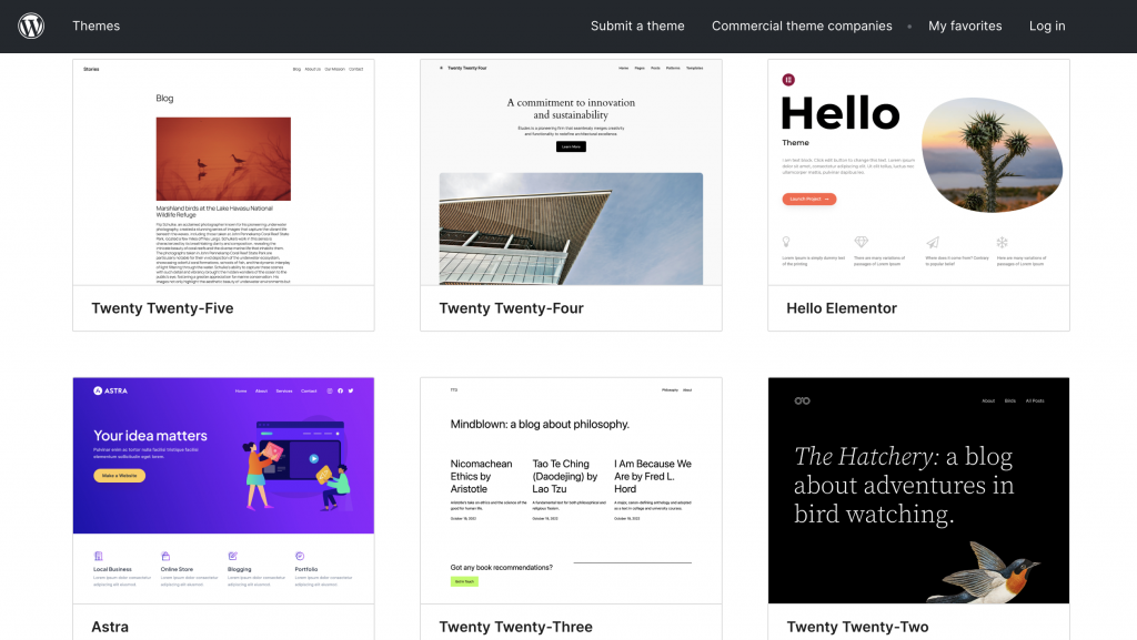
When choosing a theme, look for one that offers flexibility in design and functionality. Here are a few popular responsive themes that come highly recommended:
- Astra: Known for its speed and lightweight design, Astra is versatile and works well with various page builders.
- OceanWP: This theme is highly customizable and perfect for any type of website, from blogs to eCommerce stores.
- Divi: With its built-in drag-and-drop builder, Divi allows you to create stunning layouts without any coding knowledge.
- GeneratePress: A clean and minimalistic theme that prioritizes performance and usability.
By starting with a responsive theme, you’re laying a strong foundation for your site’s mobile performance. So take your time to explore these options and choose one that aligns with your vision!
Use Fluid Grid Layouts
Fluid grid layouts are a fantastic way to ensure your website adjusts beautifully across various screen sizes. Unlike fixed layouts that use specific pixel widths, fluid grids use relative units like percentages to create a flexible structure.
This means that elements on your site will resize proportionally, allowing for an adaptable and visually appealing design.
So, why should you consider using a fluid grid layout? For starters, it enhances user experience by maintaining a cohesive look that feels natural on any device.
As users switch from their desktop to mobile or tablet, they’ll appreciate the smooth transition without awkward gaps or awkward overlaps in content.
Here are some practical tips for implementing a fluid grid in your WordPress site:
- Use CSS for Layout: Instead of relying solely on fixed pixel sizes, use CSS properties like
widthset in percentages. For example, setting a container width to100%will allow it to stretch across the available space, while a sidebar could be set to30%to leave room for the main content. - Leverage Page Builder Plugins: Many page builder plugins, such as Elementor or Beaver Builder, have built-in options for fluid layouts. These tools allow you to drag and drop elements while automatically adjusting their sizes based on the screen size.
- Breakpoints and Media Queries: Identify key breakpoints where your layout needs to change (e.g., at 768px for tablets). Use media queries in your CSS to adjust styles at these breakpoints, ensuring your layout remains cohesive across devices.
- Test Responsiveness: Once you’ve implemented your fluid grid layout, test it on different devices and screen sizes. Tools like Google’s Mobile-Friendly Test can help you see how well your site performs on mobile devices.
By incorporating fluid grid layouts into your WordPress design, you’re taking a significant step toward making your site responsive.
Optimize Images
When it comes to making your WordPress site responsive, optimizing images is a game-changer. Large, unoptimized images can slow down your site, leading to longer load times and a frustrating experience for users.
In fact, studies show that 47% of consumers expect a web page to load in two seconds or less. If your images are dragging your site down, you risk losing visitors before they even see your content!
So, why is image optimization so important? First, optimized images significantly improve your website’s speed, which is a crucial factor in both user experience and SEO rankings.
Moreover, responsive images ensure that the right size is served to different devices, preventing unnecessary data usage and enhancing loading times on mobile.
Faster loading times lead to happier users, and happy users are more likely to return to your site. So take the time to optimize those images—your website will thank you!
Implement Media Queries
Media queries are a powerful tool in responsive web design, allowing you to apply different styles based on the device’s characteristics, such as screen size or orientation.
Think of media queries as your website’s way of saying, “Hey, I see you’re using a smaller screen. Let me adjust and provide the best experience for you!”
This means you can customize your site’s layout and appearance for desktops, tablets, and smartphones, ensuring a seamless user experience across all devices.
So, how do you use media queries effectively in your WordPress site? Here’s a simple breakdown:
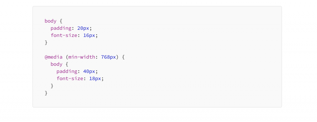
- Basic Syntax: A media query typically consists of the
@mediarule followed by conditions that specify when the styles should apply. Here’s a basic example:@media (max-width: 768px) { body { background-color: lightblue; } .container { width: 100%; padding: 20px; } }In this example, if the screen width is 768 pixels or less, the background color will change to light blue, and the container will take up the full width with some padding. - Set Breakpoints: Identify key breakpoints where your layout needs to change. Common breakpoints include:
- 480px for mobile devices
- 768px for tablets
- 1024px for desktop
- Adjust Font Sizes and Layouts: Use media queries to change font sizes, margins, and layouts for various devices. For example, you might want larger text on desktop screens while keeping it smaller for mobile devices to ensure readability.
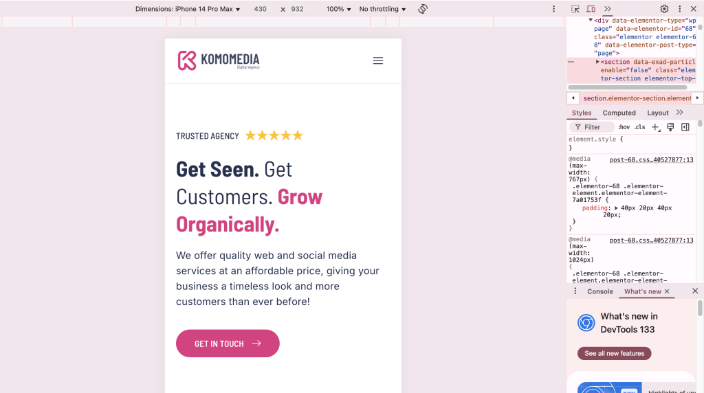
@media (max-width: 480px) { h1 { font-size: 24px; } } - Test Your Changes: After implementing media queries, be sure to test your site on various devices and screen sizes. Tools like Chrome’s Developer Tools allow you to simulate different device screens to see how your site responds.
By effectively using media queries, you can make your WordPress site look great on any device while providing an optimal user experience.
Test Responsiveness Regularly
After putting in all the hard work to make your WordPress site responsive, the last thing you want is for it to fall short on certain devices or browsers.
That’s why testing responsiveness regularly is crucial! Ensuring that your site looks and functions perfectly across various platforms helps you catch any issues before your visitors do.
After all, a seamless experience leads to happier users and better engagement.
So, why is testing so important? Different devices and browsers can render your site in unexpected ways due to variations in screen sizes, resolutions, and even browser capabilities.
A design that looks fantastic on a desktop may not translate well to a smartphone or tablet. By regularly testing your site, you can identify and fix any layout problems, broken links, or loading issues that may arise.
Here are some effective tools to help you test the responsiveness of your website:
Google’s Mobile-Friendly Test: This tool is simple to use—just enter your URL, and it will analyze your site to determine how well it performs on mobile devices. It also provides suggestions for improving mobile usability.
BrowserStack: A comprehensive tool that allows you to test your website across a wide range of real devices and browsers. It’s perfect for getting a feel for how your site behaves in different environments.
Responsive Design Mode in Browsers: Most modern browsers, like Chrome and Firefox, have built-in responsive design modes that let you simulate how your site looks on various devices. You can access these features through the developer tools (usually found under the “Inspect” option).
By routinely testing your website with these tools, you can ensure a consistent and enjoyable experience for all users, regardless of how they access your site.
Tools and Resources for Responsive Design
Creating a responsive WordPress site can be made even easier with the right tools and resources. There are several plugins available that can help enhance the responsiveness of your website, making it more user-friendly across various devices.
Here’s a list of essential plugins that you should consider incorporating into your WordPress toolkit:
Recommended Plugins
WP Touch: This plugin automatically enables a mobile-friendly version of your WordPress site for mobile devices. It’s incredibly easy to set up and customize, allowing you to provide a seamless experience for mobile users without needing to change your theme.
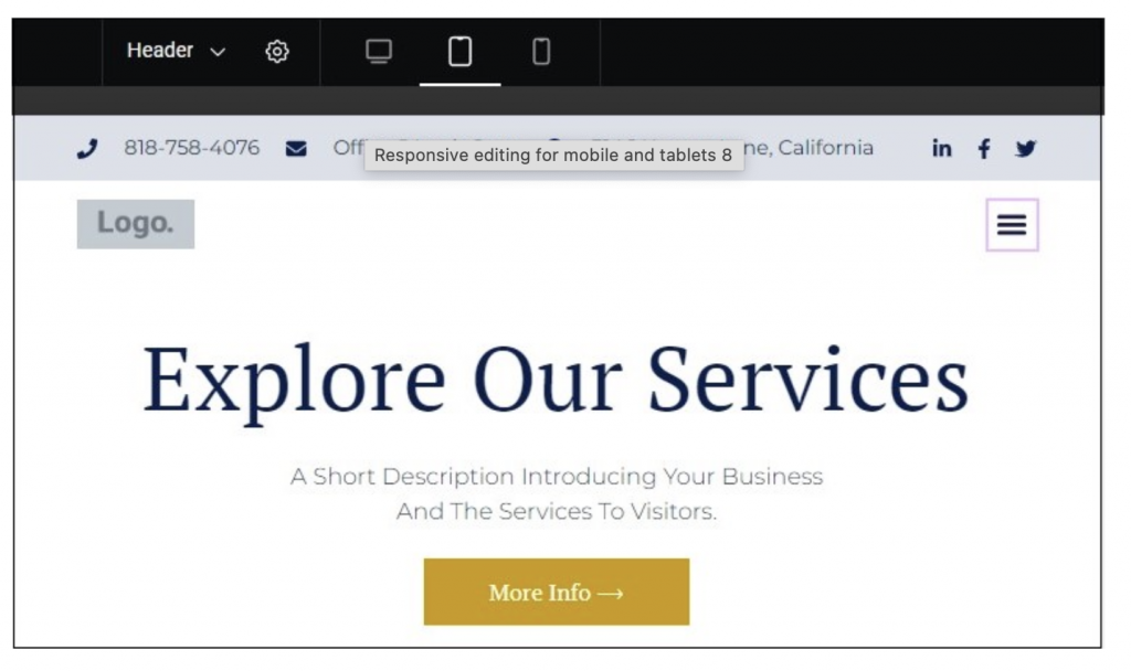
Elementor: A popular drag-and-drop page builder, Elementor allows you to create stunning responsive designs without any coding skills. You can easily adjust layouts, font sizes, and image placements for different devices, ensuring your site looks great everywhere.
Responsive Menu: If your site has a complex menu structure, the Responsive Menu plugin can help create a mobile-friendly version of your navigation. It provides customizable options for styling and functionality, making it easier for users to find their way around on smaller screens.
Smush: As mentioned earlier, Smush is an image optimization plugin that helps compress and optimize images without sacrificing quality. By reducing image sizes, it enhances loading times and boosts the responsiveness of your site.
WP Responsive Recent Posts Slider: This plugin allows you to create responsive sliders for displaying recent posts or featured content. It’s a great way to keep your site engaging while ensuring that sliders look good on any device.
CSS Hero: This powerful plugin lets you customize your WordPress theme’s CSS without needing to write any code. You can preview changes in real-time and ensure that your adjustments work well across different screen sizes.
ShortPixel Image Optimizer: Another excellent option for image optimization, ShortPixel compresses images to improve load times and overall performance. It also supports WebP format, which helps deliver high-quality images with smaller file sizes.
By utilizing these plugins, you can significantly enhance the responsiveness of your WordPress site, making it more accessible and enjoyable for all users.
If you need help creating your website, don’t hesitate to contact us. Click here.
Conclusion
Making your WordPress site responsive is essential for providing an optimal user experience and staying competitive in today’s digital landscape. By choosing a responsive theme, utilizing fluid grid layouts, optimizing images, implementing media queries, and testing regularly, you can ensure that your website looks great and functions smoothly on any device. Remember, a well-optimized site not only keeps your visitors happy but also boosts your search engine rankings.
If you need assistance with implementing these tips or have any questions, don’t hesitate to reach out! You can contact us through our contact form, or connect with us on Instagram or Facebook. We’re here to help you create a stunning responsive website that stands out!