Are you ready to turn your website visitors into loyal customers? If so, mastering the art of the click-through landing page is your secret weapon.
This powerful type of page doesn’t just capture attention—it guides your visitors smoothly toward taking action, whether that’s making a purchase, signing up, or exploring your services.
In this post, you’ll discover exactly what a click-through landing page is, why it matters for your business, and how you can create one that truly converts.
Let’s dive in and unlock the potential of your online presence together!

If you need help creating your website, don’t hesitate to contact us. Click here.
What is a Click-Through Landing Page?
You might be wondering, what is a click-through landing page and why should it matter to you?
Simply put, a click-through landing page is a specially designed webpage that acts as a stepping stone between your visitor’s initial interest and the final action you want them to take e.g. like making a purchase or signing up for a service.
Unlike lead capture pages that ask for contact details upfront, click-through pages focus on warming up your visitors by providing clear, concise information and encouraging them to click through to the next step.
Think of it as a friendly guide that gently leads your visitors closer to becoming customers without overwhelming them.
Its main purpose is to reduce distractions, so your visitors stay focused on the one thing you want them to do next.
This streamlined approach can significantly boost your conversion rates and make your marketing efforts much more effective.
Why Click-Through Landing Pages Matter
Click-through landing pages play a crucial role in the buyer’s journey. They act as a bridge between curiosity and commitment, helping visitors understand the value of your offer before they take action.
According to recent studies, businesses that use dedicated landing pages see up to 55% higher conversion rates compared to those that don’t.
By keeping your visitors focused and minimizing unnecessary links or information, these pages cut down on confusion and hesitation.
This clarity is essential in online sales, where every second counts and attention spans are short.
Key Elements of an Effective Click-Through Landing Page
Clear and Compelling Headline
Your headline is the first thing visitors see, so it needs to grab their attention immediately. Think of it as your page’s handshake—strong, confident, and inviting.
Without a clear and compelling headline, visitors might quickly lose interest and leave before they even read more.
A great headline focuses on the benefits your visitor will get, not just the features of your product or service. Instead of saying, “We offer web design services,” try something like, “Get a Stunning Website That Grows
Your Business.” This approach speaks directly to what your visitors care about and makes them want to learn more.
Persuasive Subheadline
Your headline grabs attention, but your subheadline is where you build on that interest. Think of it as your chance to offer a little more detail that convinces visitors why they should stick around.
A strong subheadline supports your headline by highlighting additional benefits or unique value your product or service offers.
For example, if your headline promises a stunning website, your subheadline could explain how your designs are tailored to boost sales and improve user experience.
This extra layer of information reassures visitors that they’re in the right place and gently guides them toward clicking through.
Engaging Visuals
Humans are wired to respond to visuals, so using relevant images or videos is a powerful way to reinforce your message. Whether it’s a photo of a happy customer, a demo video of your product, or clean, attractive design elements, visuals help visitors quickly understand what you offer and how it benefits them.
But remember, visuals must be professional and load quickly. Slow-loading images or cluttered design can frustrate visitors and cause them to leave before they even see your content.
Investing in high-quality visuals and optimizing their size for fast loading creates a smooth, enjoyable experience—making visitors more likely to click through and engage with your offer.
Concise and Benefit-Oriented Copy
When it comes to the text on your click-through landing page, less is more. Using simple, jargon-free language ensures that every visitor—no matter their background—can understand your message quickly and easily.
Avoid complicated terms or technical details that might confuse or overwhelm your audience.
Focus your copy on the benefits your visitors will gain, not just the features of your product or service. Instead of listing what your product does, explain how it solves their problems or improves their life.
For example, say “Save time and grow your business” instead of “Includes automation tools.” This approach connects with your visitors on a personal level and motivates them to take action.
Strong Call-to-Action (CTA) Button
Your call-to-action (CTA) button is the make-or-break element of your landing page. It needs to be clear and actionable so visitors know exactly what will happen when they click.
Use straightforward text like “Buy Now,” “Get Started,” or “Claim Your Discount” that creates a sense of urgency and excitement.
Placement is just as important as the text. Position your CTA button where it’s easy to find—usually above the fold and again near the bottom of the page for longer content.
Use colors that stand out from the rest of your page but still fit your brand’s style. A well-designed CTA button draws the eye naturally and encourages visitors to take the next step with confidence.
Trust Elements
Building trust with your visitors is essential for encouraging them to take that crucial next step. One of the most effective ways to do this is by including customer testimonials or reviews on your click-through landing page.
Real feedback from satisfied clients shows potential customers that others have had positive experiences with your product or service, making them feel more confident about choosing you.
Another important trust factor is displaying security badges or guarantees. Whether it’s a money-back guarantee, secure payment icons, or certifications, these elements reassure visitors that their information and purchase are safe.
When you make your visitors feel secure and valued, they’re much more likely to click through and complete the desired action.
Best Practices for Designing Click-Through Landing Pages
Keep It Simple and Focused
When designing your click-through landing page, simplicity is key. Avoid cluttering the page with too much information, multiple links, or distractions that can confuse your visitors.
Your page should have one clear goal whether it’s to get visitors to buy, sign up, or learn more. Keeping everything focused helps guide your visitors smoothly toward that goal without overwhelming them.
Optimize for Mobile Devices
More people than ever browse the web on their phones or tablets. That’s why your landing page must have a responsive design that looks great and works perfectly on all screen sizes.
If your page isn’t mobile-friendly, you risk losing a large portion of potential customers who might struggle to navigate or take action on your site.
Use A/B Testing
Even small changes can have a big impact on your landing page’s performance. By running A/B tests, you can compare different versions of headlines, images, or call-to-action buttons to see what resonates best with your audience.
This data-driven approach lets you continuously improve your page and increase conversions over time.
Fast Loading Speed
Visitors expect websites to load quickly—if your landing page takes too long, they’ll click away before seeing your offer. Minimizing load times not only improves user experience but also helps with search engine rankings.
Optimize images, use clean code, and choose reliable hosting to keep your page fast and smooth.
Use Clear Navigation Paths
Your page should guide visitors naturally toward the call-to-action. Avoid confusing navigation menus or multiple exit points that distract from your goal. Instead, create a clear, straightforward path that keeps visitors focused and encourages them to take the next step confidently.
Examples of Successful Click-Through Landing Pages

Industry:
Gaming
Engagement Strategies
Immersive Narrative: The landing page for Banishers: Ghosts of New Eden pulls visitors in with detailed descriptions and striking visuals that highlight the thrilling action RPG experience. This storytelling approach keeps users interested and excited about the game.
Simplified Purchase Path: A smart feature on the page is the sticky bar with a clear “Buy now” button that stays visible as visitors scroll. This makes it super easy for users to take action without searching for the purchase option.
Key Takeaways:
This example shows how using repeated calls-to-action (CTAs) paired with engaging, relevant content can spark curiosity and encourage visitors to move forward in the buying process. It’s a great reminder that making the path to purchase simple and inviting can boost your conversions dramatically.

Industry: Bedding
Strategies:
Focused Goal: Even though Coco Village showcases a range of bedding products, the landing page stays focused on one clear goal—encouraging visitors to take advantage of a sale or discount offer. This sharp focus prevents distractions and drives action.
Visual Product Display: The page uses striking visuals to showcase their products attractively while keeping the overall message simple and compelling. This balance helps visitors quickly understand the offer and feel motivated to buy.
Takeaways:
Coco Village’s landing page is a great example of how clear messaging combined with eye-catching visuals can highlight value and encourage conversions effectively.
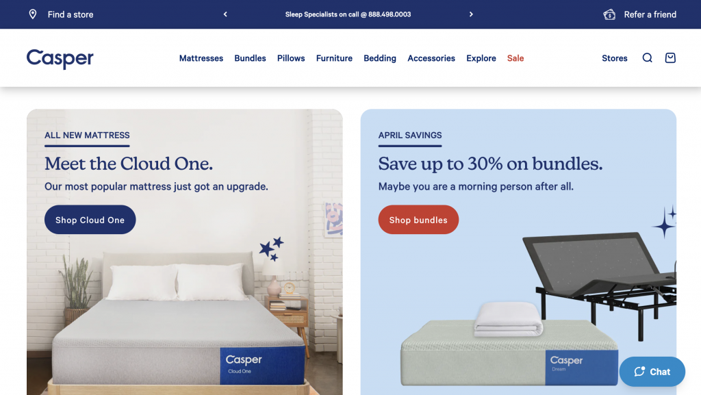
Industry: Mattresses
Strategies:
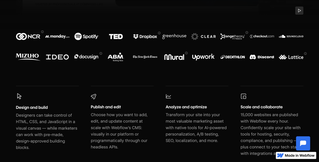
Social Proof: Casper builds trust by featuring testimonials from influential brands, which adds strong credibility and reassures visitors about the quality of their products.
Clear Navigation: The landing page includes a clear pricing chart that helps visitors compare options easily, along with a contrasting „Shop Now“ CTA button that stands out and guides users toward making a purchase.
Takeaways: Casper’s approach highlights how combining social proof with straightforward navigation creates a smooth, trustworthy experience that encourages visitors to take action confidently.
If you need help creating your website, don’t hesitate to contact us. Click here.
Conclusion
Understanding what a click-through landing page is and how to design one effectively can make a huge difference in turning your website visitors into loyal customers. Remember, the key is to keep your page simple, focused, and user-friendly—with clear headlines, strong calls-to-action, engaging visuals, and trust-building elements. These features work together to guide your visitors smoothly toward taking the action you want.
If you’re ready to boost your conversions but need some expert help creating a high-performing click-through landing page, we’re here for you. Feel free to reach out anytime via our contact form or connect with us on Instagram and Facebook. Let’s build something great together!