
Are you gearing up for a new product launch and looking to make a splash? Your pre-launch landing page could be the secret ingredient to igniting excitement and capturing interest!
In today’s digital landscape, a well-crafted landing page not only creates buzz but also builds a community of eager supporters before your big debut.
In this post, we’ll explore 10 inspiring pre-launch landing page examples that can elevate your campaign and turn curious visitors into loyal customers.
Get ready to discover creative ideas and practical tips that will set your launch up for success.
Let’s dive in and transform your vision into reality!

If you need help creating your website, don’t hesitate to contact us. Click here.
What is a Pre-Launch Landing Page?
So, what exactly is a pre-launch landing page? Simply put, it’s a standalone web page that you create before launching your product or service.
Think of it as your first opportunity to showcase what’s coming and get people excited! The main goals of a pre-launch landing page are to collect leads, generate buzz, and test your ideas with potential customers.
By capturing email addresses before your launch, you can build a list of interested people who want to know more about your offering.
This not only helps you gauge interest but also allows you to keep them updated as you get closer to launch day.
In fact, according to a study by OptinMonster, using a pre-launch landing page can increase your email sign-ups by up to 300%! Imagine having a ready-made audience eager for your product when you finally go live.
Key Elements to Include
To make your pre-launch landing page truly effective, there are several key elements you should include:
- Compelling Headlines: Your headline is the first thing visitors will see, so make it catchy and informative. It should clearly communicate what your product is about and why they should care.
- Clear Call-to-Action (CTA): A strong CTA guides visitors on what to do next. Whether it’s signing up for updates, downloading an exclusive preview, or following you on social media, make sure it’s easy to find and understand.
- Engaging Visuals and Branding: Use appealing images and consistent branding to create a memorable experience. Visuals should reflect the essence of your product and resonate with your target audience.
By focusing on these elements, you can create a pre-launch landing page that not only captures attention but also converts curious visitors into eager supporters.
Remember, the more engaging your page is, the more likely visitors will want to stick around and learn about what you have to offer!
Why You Need a Pre-Launch Landing Page
Creating a pre-launch landing page is a powerful strategy that can significantly impact your product’s success. One of the biggest benefits is that it helps you build anticipation for your product or service.
The Benefits of Early Engagement
When potential customers see a sneak peek of what’s coming, their excitement grows, and they’re more likely to talk about it with friends and family.
This buzz can lead to organic word-of-mouth marketing, which is incredibly valuable.
Additionally, a pre-launch landing page allows you to create a list of interested prospects. By encouraging visitors to sign up for updates or exclusive content, you can collect email addresses and build a database of eager supporters.
According to HubSpot, businesses that prioritize email marketing can see conversion rates as high as 66%. This means that when you finally launch your product, you’ll have a ready-made audience waiting to hear from you!
Establishing Brand Presence
Another critical reason to invest in a pre-launch landing page is that it helps you establish your brand presence in the market before your official launch.
By putting your brand out there early, you begin to create awareness and recognition among your target audience. This is especially important in today’s crowded marketplace, where standing out can be a challenge.
Moreover, starting your marketing efforts early allows you to create a loyal audience from the get-go. When people feel connected to your brand before it even launches, they are more likely to become loyal customers once your product is available.
10 Inspiring Pre-Launch Landing Page Examples
Creating an effective pre-launch landing page can set the tone for your product’s success. Here are 10 inspiring pre-launch landing page examples that not only capture attention but also engage visitors and encourage sign-ups.
1. Stripe
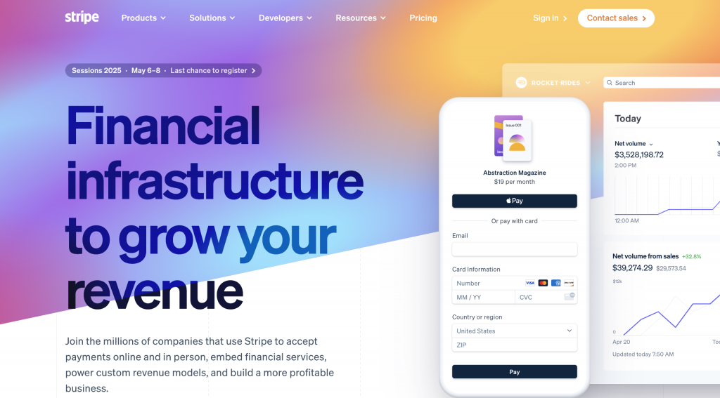
Stripe is a leading payment processing platform that allows businesses to easily accept payments online. During its pre-launch phase, Stripe created a landing page that effectively generated buzz and excitement among potential users.
Features
The landing page features a clean and modern design that emphasizes its core value proposition: simplifying the payment process for businesses of all sizes. Here are some key elements that make Stripe’s pre-launch landing page effective:
Straightforward Messaging
Strong Value Proposition: The headline clearly communicates the benefits of using Stripe, making it easy for visitors to understand what the service offers.
Clear Call-to-Action (CTA)
A prominent button invites users to sign up for early access. This CTA is strategically placed and uses actionable language, encouraging visitors to take the next step.
Engaging Visuals
The page includes appealing graphics and illustrations that visually represent how Stripe works, enhancing user understanding and interest.
Social Proof
Featuring testimonials and logos of well-known companies that use Stripe builds credibility and trust, reassuring potential users about the reliability of the service.
By focusing on these elements, Stripe’s pre-launch landing page successfully captured the attention of its target audience and encouraged them to join the platform early, setting the stage for a successful launch.
2. Dropbox
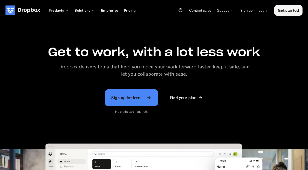
Dropbox is a popular cloud storage service that allows users to store and share files easily. During its pre-launch phase, Dropbox utilized a compelling landing page to attract early adopters and generate excitement about its innovative file-sharing capabilities.
Features
The Dropbox pre-launch landing page is designed with a focus on simplicity and clarity, which effectively communicates its core offering. Here are some key elements that contribute to the effectiveness of Dropbox’s pre-launch landing page:
Straightforward Messaging
The headline succinctly conveys the main benefit of using Dropbox—easy access to files from anywhere. This clear messaging helps visitors quickly understand the value of the service.
Prominent Call-to-Action (CTA)
The landing page features a strong and easily visible CTA inviting visitors to sign up for early access. This simple action encourages interested users to join the platform before it officially launches.
Engaging Visuals
Dropbox employs visually appealing graphics that illustrate how users can upload, access, and share their files seamlessly. These visuals help potential customers visualize the service in action and understand its functionality.
User-Centric Design
The layout is clean and intuitive, making it easy for visitors to navigate the page. This user-friendly design enhances the overall experience and keeps visitors engaged.
Social Proof
Including testimonials from early users or recognizable brands that endorse Dropbox adds credibility and reassures potential users about the reliability and effectiveness of the service.
By incorporating these elements, Dropbox’s pre-launch landing page successfully generated interest and excitement, encouraging visitors to sign up for updates and paving the way for a successful launch of their cloud storage solution.
3. Airbnb
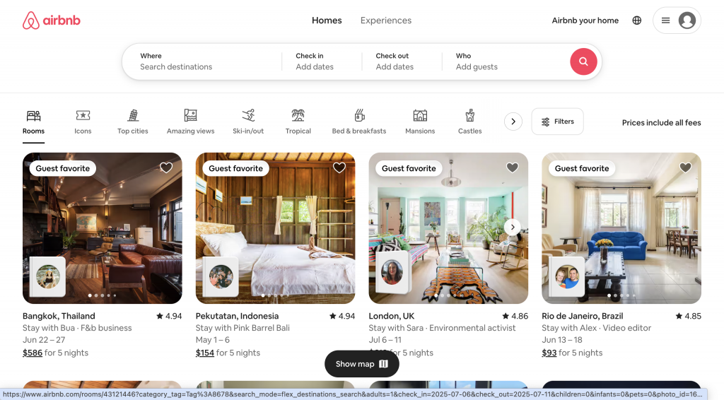
Airbnb is a leading online marketplace that connects travelers with hosts offering unique accommodations around the world. During its pre-launch phase, Airbnb effectively utilized a landing page to create buzz and anticipation for its innovative platform.
Features
The Airbnb pre-launch landing page is designed to engage potential users and clearly convey the value of the service. Here are some key elements that contribute to the success of Airbnb’s pre-launch landing page:
Stunning Visuals
The landing page features high-quality images of beautiful properties and unique accommodations available through the platform. These visuals not only capture attention but also inspire wanderlust, encouraging visitors to imagine their next adventure.
Compelling Messaging
The headline emphasizes the unique experience of staying in someone’s home rather than a traditional hotel. This messaging appeals to travelers looking for authentic and personalized experiences, setting Airbnb apart from conventional lodging options.
Clear Call-to-Action (CTA)
A prominent CTA encourages visitors to sign up for notifications about new listings and updates. This clear invitation makes it easy for potential users to express their interest and stay informed about the platform’s launch.
Community Focus
The page highlights the sense of community that Airbnb fosters between hosts and guests. By showcasing personal stories and testimonials, Airbnb creates an emotional connection with visitors, making them more likely to engage with the platform.
User-Friendly Design
The layout is clean and intuitive, allowing visitors to easily navigate the page and find the information they need. This simplicity enhances user experience and keeps potential customers engaged.
By effectively combining these elements, Airbnb’s pre-launch landing page generated excitement and anticipation for its platform, encouraging travelers and hosts alike to join the community before the official launch.
This strategic approach played a crucial role in establishing Airbnb as a go-to option for unique travel experiences.
4. Superhero Stuff
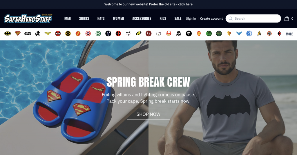
Superhero Stuff is an online retailer specializing in superhero-themed merchandise, including clothing, collectibles, and accessories. During its pre-launch phase, Superhero Stuff created an engaging landing page to promote an upcoming line of products and generate excitement among fans.
Features
The Superhero Stuff pre-launch landing page effectively captures the essence of the brand while enticing visitors with its unique offerings. Here are some key elements that contribute to the effectiveness of their pre-launch landing page:
Dynamic Countdown Timer
One standout feature of the page is a dynamic countdown timer that creates a sense of urgency. This element encourages visitors to act quickly and sign up for updates, as they know that the launch is just around the corner.
Vibrant Imagery
The landing page showcases eye-catching visuals of the upcoming superhero merchandise, including apparel and collectibles. These vibrant images not only capture attention but also resonate with the target audience—superhero fans who are eager to see new products.
Compelling Copy
The messaging on the page is enthusiastic and captures the excitement of the superhero genre. By highlighting the unique aspects of the merchandise and what makes it special, Superhero Stuff effectively engages potential customers.
Clear Call-to-Action (CTA)
A prominent CTA invites visitors to subscribe for exclusive early access offers. This clear invitation encourages fans to stay informed about the product launch and be among the first to know when the items become available.
Social Media Integration
The landing page encourages visitors to follow Superhero Stuff on social media platforms, fostering community engagement and allowing fans to connect and share their excitement about the upcoming launch.
By incorporating these elements, Superhero Stuff’s pre-launch landing page successfully builds anticipation and excitement for its new line of superhero-themed merchandise.
This strategic approach not only engages fans but also establishes a strong foundation for a successful product launch.
5. Figma
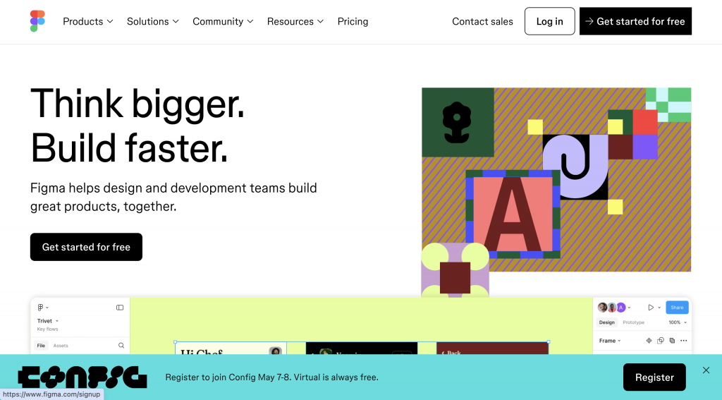
Figma is a collaborative web-based design tool that allows teams to create, prototype, and share designs in real-time. During its pre-launch phase, Figma effectively utilized a landing page to generate interest and excitement among designers and teams.
Features
The Figma pre-launch landing page is designed to engage potential users and clearly communicate the benefits of using the platform. Here are some key elements that contribute to the success of Figma’s pre-launch landing page:
Engaging Visuals
The landing page features vibrant, high-quality graphics that showcase the platform’s capabilities, including collaborative design features and user-friendly interfaces. These visuals help visitors visualize how Figma can enhance their design workflow.
Clear Value Proposition
The headline prominently communicates Figma’s unique selling points, emphasizing its real-time collaboration features and ease of use. This clear messaging resonates with design teams looking for efficient tools to streamline their processes.
Compelling Copy
The copy on the page is concise yet informative, explaining how Figma can improve teamwork and productivity in design projects. This approach effectively engages visitors by addressing their needs and pain points.
Strong Call-to-Action (CTA)
A prominent CTA invites visitors to sign up for early access, making it easy for interested users to join the community before the official launch. This encourages potential customers to take action and stay informed about updates.
Community Focus
Figma emphasizes its commitment to building a community of designers by showcasing user testimonials and success stories. This social proof helps establish credibility and builds trust among potential users.
By combining these elements, Figma’s pre-launch landing page successfully generated excitement and interest in its collaborative design tool.
The strategic focus on engaging visuals, clear messaging, and strong calls to action paved the way for a successful launch, attracting designers eager to enhance their workflow with Figma.
6. Notion
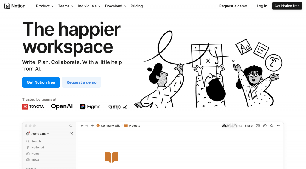
Notion is an all-in-one productivity tool that combines note-taking, task management, and collaboration features into a single platform. During its pre-launch phase, Notion effectively utilized a landing page to generate interest and excitement among potential users looking for a comprehensive productivity solution.
Features
The Notion pre-launch landing page is designed to engage visitors and clearly communicate the tool’s unique benefits. Here are some key elements that contribute to the effectiveness of Notion’s pre-launch landing page:
Compelling Visuals
The landing page features clean and modern visuals that showcase the platform’s user interface and capabilities. By displaying real-life use cases, such as project management boards and note-taking templates, Notion helps visitors envision how the tool can fit into their daily routines.
Clear Value Proposition
The headline emphasizes Notion’s versatility as an all-in-one workspace, making it clear to visitors that they can manage various tasks from one platform. This messaging resonates with users who seek efficiency and organization in their personal and professional lives.
Concise Copy
The copy on the page is straightforward and informative, explaining how Notion can streamline workflows and improve productivity. This approach effectively addresses potential users’ needs and highlights how the platform can solve common problems.
Strong Call-to-Action (CTA)
A prominent CTA encourages visitors to sign up for early access or to join the waitlist. This clear invitation not only prompts interested users to take action but also helps Notion build a list of potential customers before the official launch.
Community Engagement
Notion emphasizes its commitment to community by showcasing testimonials from early users who share their positive experiences. This social proof helps establish trust and credibility, making visitors more likely to engage with the platform.
By incorporating these elements, Notion’s pre-launch landing page successfully generated excitement and anticipation for its productivity tool.
The strategic focus on engaging visuals, clear messaging, and strong calls to action helped attract potential users eager to improve their organization and productivity with Notion.
7. Slack
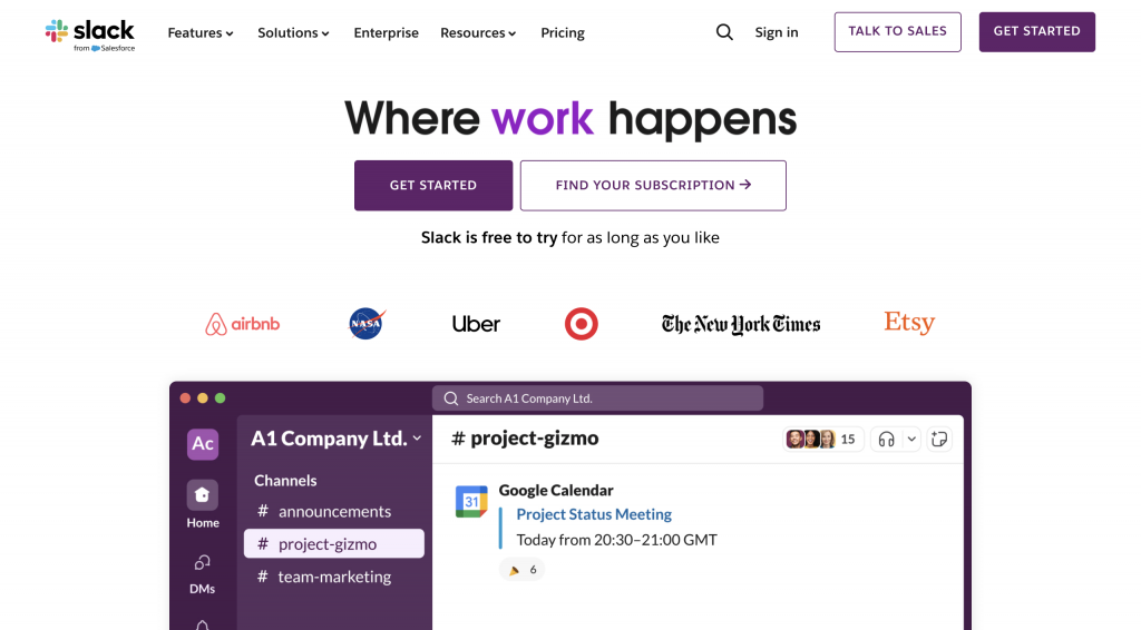
Slack is a widely-used team collaboration tool designed to enhance communication and productivity within organizations. During its pre-launch phase, Slack effectively utilized a landing page to create excitement and interest among potential users looking for a better way to communicate with their teams.
Features
The Slack pre-launch landing page is designed to engage visitors and clearly convey the benefits of using the platform. Here are some key elements that contribute to the effectiveness of Slack’s pre-launch landing page:
Simple and Inviting Design
The landing page features a clean and modern layout, making it easy for visitors to navigate and understand the core offerings. The inviting design helps create a positive first impression and fosters user engagement.
Compelling Messaging
The headline succinctly captures the essence of Slack, emphasizing how it can improve team communication. The messaging resonates with organizations looking for efficient collaboration tools that streamline workflows and eliminate email clutter.
Clear Value Proposition
The page clearly outlines the features and benefits of using Slack, such as real-time messaging, file sharing, and integration with other tools. This informative approach helps potential users quickly grasp how Slack can enhance their team’s productivity.
Prominent Call-to-Action (CTA)
A strong CTA invites visitors to sign up for updates or request early access. This clear invitation encourages interested users to take action and stay informed about the platform’s launch, fostering a sense of involvement in the process.
User Testimonials
Including testimonials from early adopters and well-known companies that use Slack builds credibility and trust among potential users. This social proof reassures visitors about the effectiveness of the platform and its ability to improve team dynamics.
By incorporating these elements, Slack’s pre-launch landing page successfully generated excitement and anticipation for its collaboration tool. The strategic focus on clear messaging, engaging design, and strong calls to action helped attract potential users eager to enhance their team communication with Slack.
8. Teespring (now Spring)
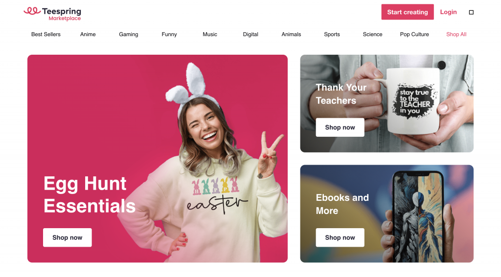
Teespring, now known as Spring, is an online platform that allows creators to design and sell custom merchandise without any upfront costs. During its pre-launch phase, Teespring effectively utilized a landing page to build excitement and attract users interested in launching their own merchandise campaigns.
Features
The Teespring pre-launch landing page is designed to engage visitors and clearly communicate the platform’s unique benefits. Here are some key elements that contribute to the effectiveness of Teespring’s pre-launch landing page:
Visually Appealing Layout
The landing page features a vibrant and eye-catching design, showcasing various custom merchandise options, including t-shirts, hoodies, and accessories. This visually appealing layout draws visitors in and highlights the creative possibilities available on the platform.
Compelling Messaging
The headline emphasizes the ease of creating and selling custom products, appealing to creators and entrepreneurs looking for a straightforward way to monetize their designs. This clear messaging helps potential users understand the value Teespring offers.
Strong Call-to-Action (CTA)
A prominent CTA encourages visitors to sign up for early access or to create their own merchandise campaigns. This clear invitation motivates interested users to take action and stay informed about the launch, fostering a sense of involvement.
Social Proof
The landing page includes testimonials from successful creators who have used Teespring to launch their merchandise, building credibility and trust with potential users. This social proof reassures visitors that the platform can help them achieve their goals.
Community Focus
Teespring emphasizes its commitment to supporting creators by showcasing success stories and providing resources for new users. This community-oriented approach fosters a sense of belonging, making visitors more likely to engage with the platform.
By incorporating these elements, Teespring’s pre-launch landing page successfully generated excitement and anticipation for its merchandise platform.
The strategic focus on engaging visuals, clear messaging, and strong calls to action helped attract potential users eager to explore the opportunities available through Teespring.
9. BuzzSumo
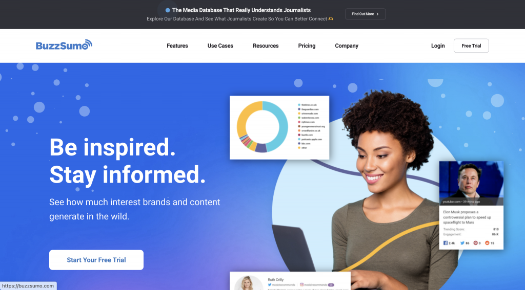
BuzzSumo is a powerful content analysis tool that helps marketers and businesses discover trending content, analyze competitor performance, and identify influencers in their niche. During its pre-launch phase, BuzzSumo utilized an engaging landing page to generate excitement and interest among content creators and marketers.
Features
The BuzzSumo pre-launch landing page is designed to effectively communicate the platform’s unique benefits while engaging potential users. Here are some key elements that contribute to the effectiveness of BuzzSumo’s pre-launch landing page:
Compelling Headline
The landing page features a strong headline that clearly outlines the primary value proposition of BuzzSumo: empowering users to create better content by understanding what resonates with their audience. This clear messaging captures the attention of content marketers looking for insights to improve their strategies.
Visually Engaging Design
The page includes appealing visuals that demonstrate the platform’s features, such as content discovery, performance metrics, and social engagement statistics. These visuals help potential users visualize how BuzzSumo can enhance their content marketing efforts.
Informative Copy
The copy on the landing page is concise and informative, explaining how BuzzSumo can simplify the process of content research and analysis. By addressing the pain points of content marketers, the messaging resonates with visitors and highlights the platform’s usefulness.
Strong Call-to-Action (CTA)
A prominent CTA invites visitors to sign up for early access or join the waitlist. This clear invitation encourages interested users to take action and stay updated on the platform’s launch, fostering a sense of involvement in the process.
Social Proof
The landing page includes testimonials from industry experts and well-known brands that have benefited from using BuzzSumo. This social proof builds credibility and trust, reassuring potential users about the effectiveness of the tool in improving their content strategies.
By incorporating these elements, BuzzSumo’s pre-launch landing page successfully generated excitement and anticipation for its content analysis tool.
The strategic focus on compelling messaging, engaging visuals, and strong calls to action helped attract potential users eager to leverage BuzzSumo for their content marketing efforts.
10. Trello
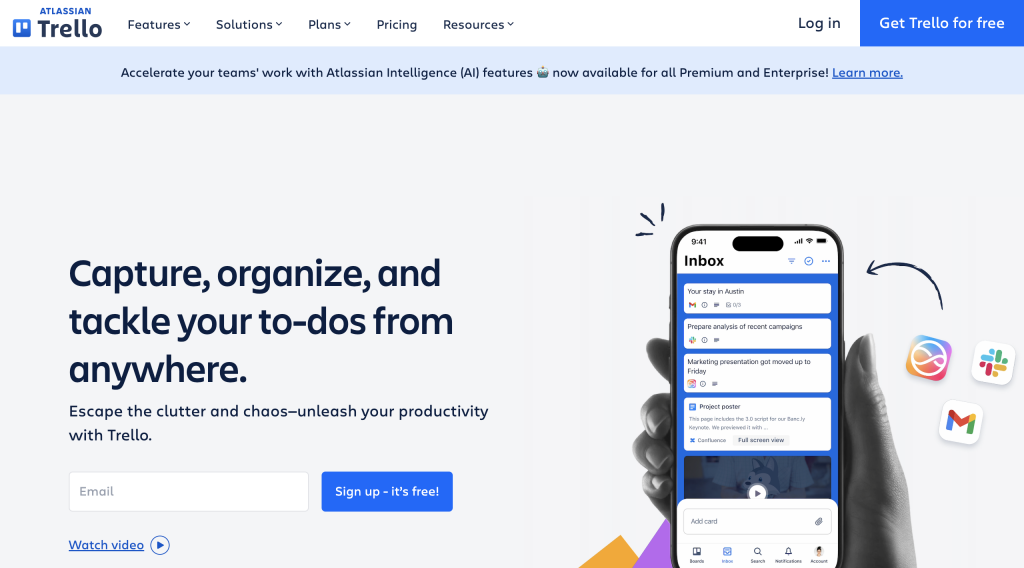
Trello is a popular project management tool that uses boards, lists, and cards to help individuals and teams organize tasks and collaborate effectively. During its pre-launch phase, Trello utilized a well-crafted landing page to generate excitement and attract users interested in improving their productivity and workflow.
Features
The Trello pre-launch landing page is designed to engage potential users and clearly communicate the platform’s unique benefits. Here are some key elements that contribute to the effectiveness of Trello’s pre-launch landing page:
Visually Engaging Interface
The landing page features a clean and colorful design that showcases Trello’s user-friendly interface. By displaying how boards and cards work, visitors can easily understand how the platform can help them manage their projects more efficiently.
Compelling Messaging
The headline emphasizes Trello’s ability to simplify project management and enhance collaboration among team members. This clear messaging resonates with individuals and teams looking for effective solutions to stay organized.
Informative Copy
The copy on the landing page is concise and focused, outlining the key features of Trello, such as task tracking, collaboration tools, and integration with other applications. This informative approach helps potential users grasp the full scope of what Trello offers.
Strong Call-to-Action (CTA)
A prominent CTA encourages visitors to sign up for early access or join the waitlist. This clear invitation motivates interested users to take action and ensures they remain informed about the platform’s launch.
Community Engagement
Trello emphasizes its commitment to building a community of users by showcasing testimonials from satisfied customers who share their positive experiences. This social proof not only builds trust but also demonstrates how Trello can positively impact productivity.
By incorporating these elements, Trello’s pre-launch landing page successfully generated excitement and anticipation for its project management tool. The strategic focus on engaging visuals, clear messaging, and strong calls to action helped attract potential users eager to enhance their productivity and collaboration with Trello.
How to Measure Success After Launch
Once your pre-launch landing page has done its job and your product is launched, it’s essential to evaluate the success of your campaign.
Measuring success involves tracking key metrics and gathering user feedback to understand what worked and what can be improved. Here’s how to effectively measure your success after launch.
Key Performance Indicators (KPIs) to Track

Conversion Rates
One of the most critical KPIs to monitor is your conversion rate. This metric measures the percentage of visitors who completed a desired action, such as signing up for updates, making a purchase, or downloading your product.
A high conversion rate indicates that your landing page successfully engaged visitors and prompted them to take action.
Regularly analyzing this metric will help you gauge the effectiveness of your messaging, design, and overall user experience.
Lead Generation Statistics
Another important KPI is your lead generation statistics. This metric tracks the number of leads collected through your pre-launch landing page, such as email sign-ups or inquiries.
Understanding how many interested prospects you gathered before launch can help you evaluate the effectiveness of your marketing efforts.
Additionally, segmenting these leads based on demographics or engagement levels can provide deeper insights into your target audience. This information can be invaluable for tailoring future marketing strategies and improving customer outreach.
Gathering Feedback for Future Improvements

After your product is launched, gathering user feedback becomes crucial for ongoing improvement. Understanding how customers perceive your product helps you identify strengths and areas that need enhancement. Engaging with users post-launch can also foster a sense of community and loyalty.
User feedback can provide insights into various aspects, such as product usability, features, and overall satisfaction. This information can guide future updates and features, ensuring that you continue to meet and exceed customer expectations.
Tools to Collect Insights from Users
There are several tools available to help you collect insights from users effectively:
- Surveys: Online survey tools like SurveyMonkey or Google Forms allow you to gather structured feedback from users about their experiences with your product.
- Feedback Forms: Incorporate feedback forms directly within your product or website, making it easy for users to share their thoughts.
- User Interviews: Conducting interviews with selected users can provide in-depth insights into their experiences and suggestions for improvement.
- Analytics Tools: Utilize analytics platforms like Google Analytics or Hotjar to track user behavior on your website or app. These tools can help identify areas where users may struggle or drop off, informing necessary adjustments.
By regularly monitoring key performance indicators and gathering user feedback, you can measure the success of your launch effectively. This ongoing evaluation process will not only help you improve your product but also enhance the overall customer experience, leading to greater satisfaction and loyalty in the long run.
If you need help creating your website, don’t hesitate to contact us. Click here.
Conclusion
Creating a compelling pre-launch landing page is essential for generating excitement and capturing interest before your product goes live. By focusing on key elements such as engaging visuals, clear messaging, strong calls to action, and social proof, you can effectively connect with your audience and build a loyal customer base. The inspiring examples we’ve explored highlight the importance of crafting a unique value proposition and fostering community engagement to ensure your launch is a success.
If you need assistance in implementing these strategies or creating your own pre-launch landing page, feel free to reach out! You can contact us via our contact form, or connect with us on Instagram or Facebook. We’re here to help you turn your vision into reality!